Author Test Items
An item must contain at least one interaction, such as inline response. Items can contain multiple interactions, such as a paired passages and an extended text area for entering an answer. Authorized users can create a variety of item interactions in ADAM and assemble them into items. The best way to learn to create items is to start with the Choice Interaction.
See also:
- Special Features Available Across Item Types
- Duplicate, Edit and Delete Items for other actions, such as importing and exporting metadata and bulk updating item statuses
- Interaction Types
Typical Workflow
For items with multiple components, you will find it most efficient to create the parts in this order:
- If multiple items will share the same images, video or audio, set them up as shared media.
- If an exhibit* (such as a formula reference sheet), passage(s) or other stimuli are needed, create those. See also: Shared Stimulus
- If applicable, assemble a paired passage from the stimuli just created. See also: Tabbed Passage
- Create the item.
*As a best practice, add exhibits at the form section level instead of the item level.
Tip for Creating Items with Shared Components
If you have an item with passages, paired passages, trait scoring, etc., you won’t want to redo the same thing for multiple items. Instead, create the first item with all the elements you need. Then clone it and swap out whatever is different, such as replacing English text for Spanish. Be sure to give the new item a unique Item Name and Identifier.
See also: Shared Stimulus
Item Properties
As part of item creation, be sure to complete the Properties tab. The Properties selection options for Name, Status, Standards and Metadata depend on bank configuration.
- Name: The field is automatically populated with a default prefix based on the item bank settings, but you can append the item to make it easier to identify.
- Reference: Non-editable item identifier.
- Status: The status of an item affects its visibility for certain user roles. The item bank settings determine what statuses are available. The selection can be used as a filter and control visibility based on user permissions but does not impact the ability to use the item on a form.
- Scoring Status: Leave as OP.
- Metadata: Enter data for provided fields, if available, to make searching items easier. These are set up at the item bank level. If there is more than one category, expand a category to view the fields.See also: Define Item Metadata.
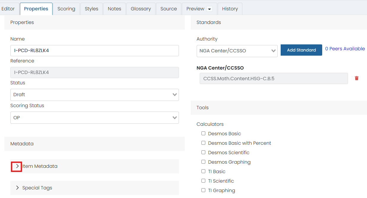
- Standard: Unless setting up trait scoring in the Scoring tab instead, align the item to a standard here. Select Add Standard and select a standard. You can repeat to add additional standards.
- Tools: Select any tool that should be available for the item. Alternatively, tools can be provided at the form section level. See also: Author a New Form,"AD Player" Student Test Tools in AD Player.
- Associated Exhibits: Select Modify Associations. Select from previously created resources. These will display in an Exhibits button in the test platform. Multiple exhibits can be added. When feasible, a best practice is to attach exhibits at the form section level instead of to an individual item. See also: Shared Passages and Other Stimulus.
- Source Documents: Attach source documents for reference if applicable.
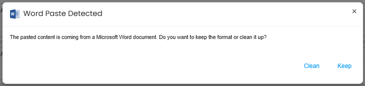
Pasting In Content from Another Source
When content already exists in another format, such as Word, you can copy and paste the text over. You may see a message with the option to clean up the formatting. The Clean option will strip away any Word formatting that might cause issues.
For images, however, do not copy and paste. Create the file as an image and insert. See also: Include Audio, Video or Images
Set Up Manual Scoring for an Item
Do not use manual scoring for autoscored items. Scoring options may differ by item type. See Item Types for links to each item creation page. See also: Scoring Types.
- In an item, select the Scoring tab.
Select the Manual Scoring checkbox. More options appear.
Optionally select Feedback Box. When enabled, scorers can enter feedback and/or rationale for their score.
- Optionally, select Reverse Score Points to arrange trait point ranges from highest to lowest.
- Select Add Trait to create scoring traits and set their point range. The Identifier doesn't show up anywhere and is for internal use only; it cannot be blank.
- Be default, the Weight for each trait is 1, but you can change this number to make one or more traits worth more.
- Optionally, link each trait to a standard to support reporting by standard.
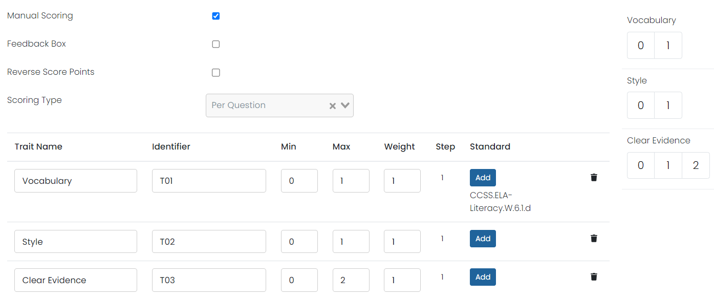
- Optionally, select the 1 in the Step column to switch to scoring at .5 increments.
- Select Save. The green 'Success' box confirms the item is successfully saved.

- Once the item is created, you can view it from the Preview tab to make sure it looks good and is scoring correctly. Test many types of expected answers that would be either correct or incorrect to verify the scoring is working as intended.