Choice Interaction
You can use the Choice interaction to create multiple choice and multi-select items.
- Go to AD Authoring > Items.
- Select the Bank where you want to create the item.
- Select Create New.
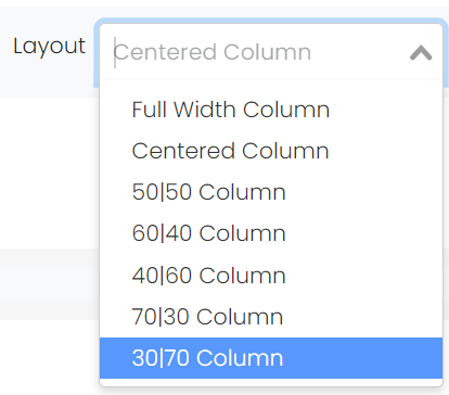
- Choose the layout for the interaction(s) in the item. For freestanding, single interaction items, it is usually best to leave at default 'Centered Column.' The 'Full Width Column' may be better for wide artwork, answer choices in multiple columns, or other content that would force left-right scrolling. Use Preview area to choose the best option. As a best practice, put passages and other shared stimulus to the left of the item prompt, using one of the available column width distributions. See also: Shared Passages and Other Stimulus.
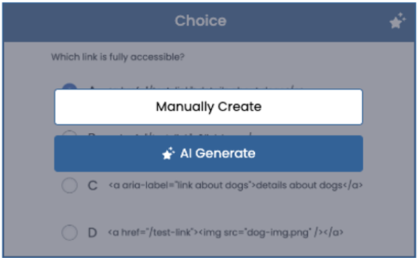
- From the Editor tab, select Add Interaction > Selected Response > Choice.
- Highlight ‘Enter your prompt’ and either type in text or paste in text copied from your clipboard. Images should be inserted as a file using the Image icon; do not copy and paste. The Prompt box for all item interactions provides several formatting tools. See also: Formatting Toolbar.

- Under Choices, enter answer choices.
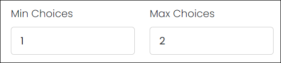
See Also: How to Include Rationales. - Select one or more correct answers. For multi-select items, increase the Max Choices under Settings and select two or more correct answers. Decide if you will set the Min and Max Choices as the actual number of correct choices, or a higher number to not give away the number of correct answers. For example, a multi-select item with three correct answers could be set as Min: 3 and Max: 5. If using partial scoring, select that option and adjust max possible points as needed.
- Under the Points column, enter a value for each answer choice.
The Settings section fields default to the most commonly used options but may be adjusted as needed and will vary by item type. Use the Preview area to view the impact of setting choices. The Choice item type contains these options:
- Label: Defaults to Upper Alpha (A, B, C, D), but may be adjusted for answer choices.
- Label Suffix: Optionally, change label to 'A.' or '(A)' formatting.
- Orientation: By default, answer choices are stacked vertically.
- Columns: By default, answers are stacked in one column to reduce the need for left-right scrolling on small testing devices.
- Min/Max Choices and Messages: To make this an item with two or more correct answers, Max Choices must be adjusted to support. For multi-select items, you can increase the level of difficulty by allowing the student to select more choices than the number of correct answers. The message fields have default text that will display for the student and can be adjusted.
- Show/Hover Rationale: See Include Rationales in an Item.
- Show Controls: This is off by default. If selected, a gray box appears around each answer choice.
- Shuffle: Do not use if choice includes 'all of the above' or similar. For the item analysis reports, the order of choices in the item setup are reflected for all students.
- In Score Settings, indicate the Max Points for the item. When using Partial Scoring, enter a point value in the Points column for each answer choice. Optionally, set Default and Minimum points. See also: Set Up Partial Scoring.
- Select the Properties tab. The Properties selection options for Name, Status, Standards and Metadata depend on bank configuration.
- Name: The field is automatically populated with a default prefix based on the item bank settings, but you can append the item to make it easier to identify.
- Reference: Non-editable item identifier.
- Status: The status of an item affects its visibility for certain user roles. The item bank settings determine what statuses are available.
- Scoring Status: Used internally.
- Depth of Knowledge (DOK): Select a DOK level from the dropdown. This does not appear in reporting.
- Metadata: Enter data for provided fields, if available, to make searching items easier. See also: Define Item Metadata.
- Standard: Select Add Standard and select a standard. You can repeat to add additional standards. If setting up trait scoring, add the standard in the Scoring tab instead.
- Tools: Enable a Calculator, Protractor, and/or Ruler for the item. See also: Student Test Tools in AD Player.
- Associated Exhibits: Select Modify Associations. Select from previously created Shared Stimulus. These will display in a ‘Exhibits’ button in the top toolbar when previewing a form. Multiple exhibits can be added. When feasible, a best practice is to attach exhibits at the section form level instead of to an individual item. See also: Shared Passages and Other Stimulus.
- Source Documents: Attach source documents for reference if applicable.
- Select Save.
AI Content Generation
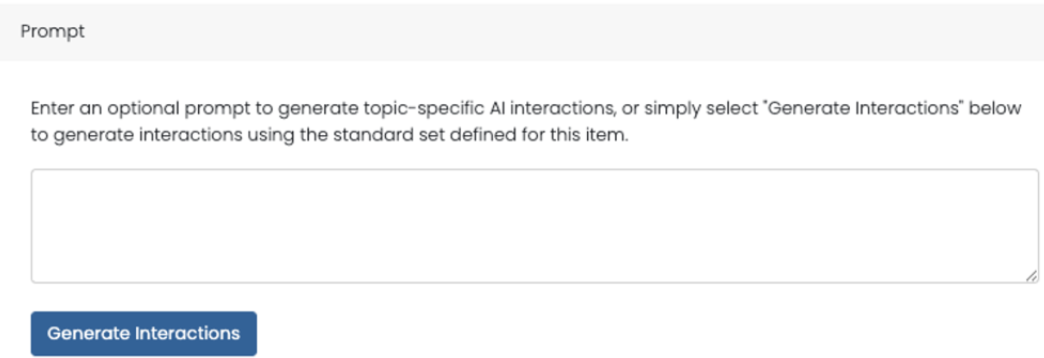
Interactions may generated off of a standard and/or a specific prompt. They can be modified as needed. Users with the correct bank-level role permissions will see an ‘AI Generate’ option on these interactions on the ‘Add Interaction’ screen on hover. Interactions that have this functionality will have the AI symbol in the top right. This process requires a standard be assigned to the item and the standards information is passed along to the AI engine.
Interactions that have this functionality will have the AI symbol in the top right. This process requires a standard be assigned to the item and the standards information is passed along to the AI engine.